Analysis
Click any image to open a PDF in a new window

Scatterplot graph comparing school districts

Line graph comparing sales and communication

Line graph created after retrieving data and creating rolling averages
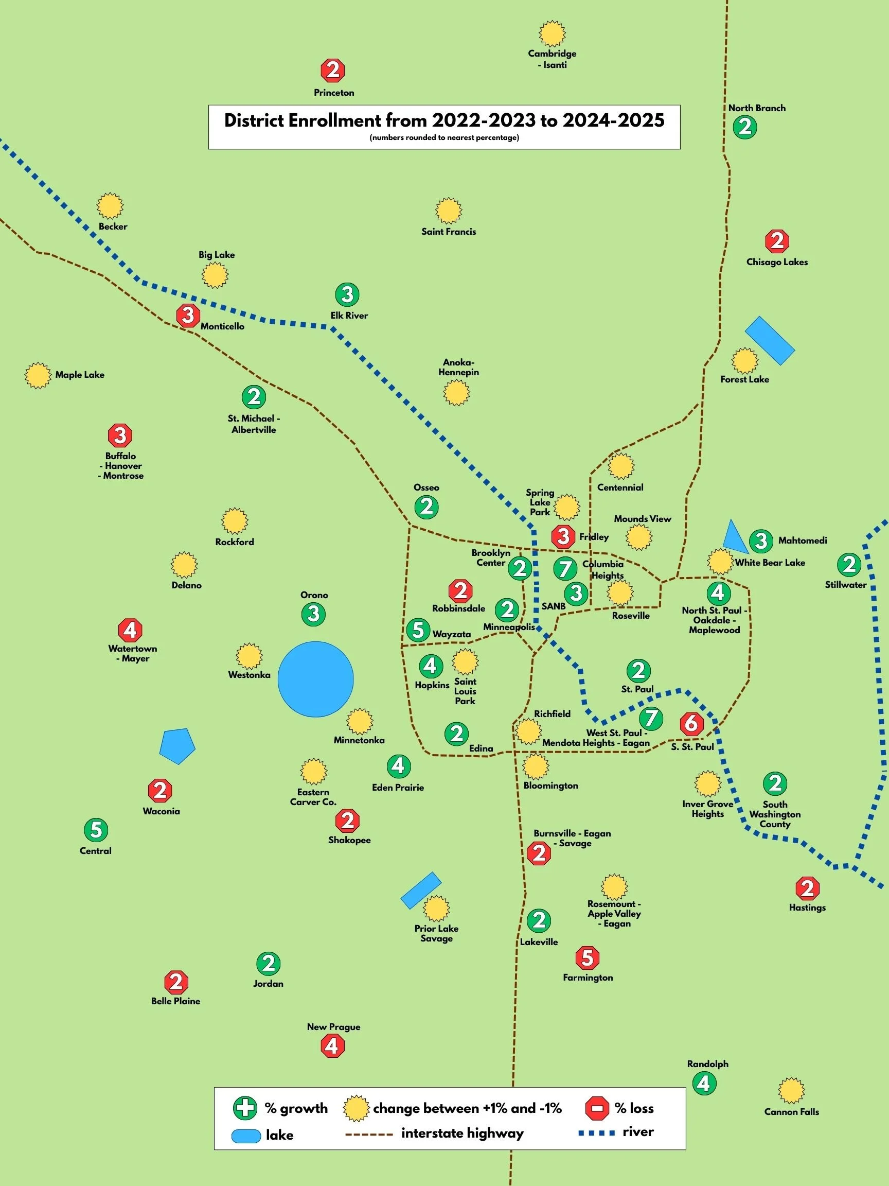
Map showing enrollment changes